Mwalimu AI
Students were drowning in LMS content with no way to ask questions, surface what mattered, or get support that felt personal. We designed the assistant that changed that.
MY ROLE
Lead UX Designer
TOOLS
Figma
Stitch AI
PRODUCT TYPE
AI Product. LMS Integration
WHAT IS MWALIMU AI
Mwalimu AI is an AI-powered learning assistant built into Learning Management Systems. It gives students the ability to ask questions about course content, get instant summaries, generate self-assessment questions, and track their own learning progress ; all without leaving their LMS.
"Mwalimu" means teacher in Swahili. The name captures exactly what this product aspires to be: a patient, always-available guide that meets every student where they are.
THE PROBLEM-LMS platforms were built for content delivery, not learning.
students consistently struggled with three compounding frustrations: they couldn't find specific information quickly, complex content had no entry point for someone who didn't already understand it, and there was no way to check whether they'd actually understood what they read.
"I read the whole module and still had no idea what I was supposed to take away from it."
Traditional LMS tools are built around delivery; they move content from institution to student. They don't support the actual cognitive work of learning: asking questions, making connections, testing recall. Mwalimu AI was designed to close that gap.
DESIGN PROCESS
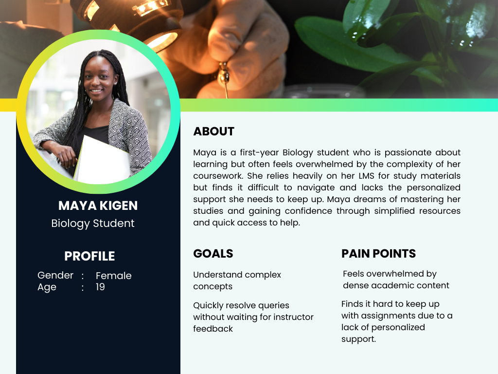
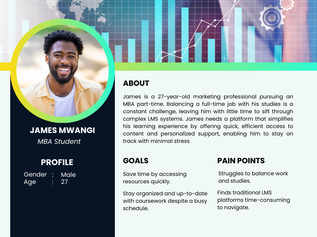
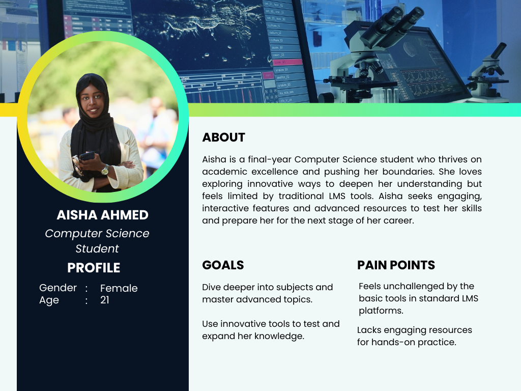
Three students, three entirely different problems.
Through stakeholder workshops and student interviews, I identified that "struggling with the LMS" meant very different things depending on the learner. Rather than designing for a generic student, we mapped three distinct user types that shaped every decision downstream.
The key insight from research: all three users were asking questions — just in different ways and at different times. A chat interface that could adapt its response depth to the question type would serve all three without needing three separate tools.
THREE CHOICES THAT DEFINED THE PRODUCT.
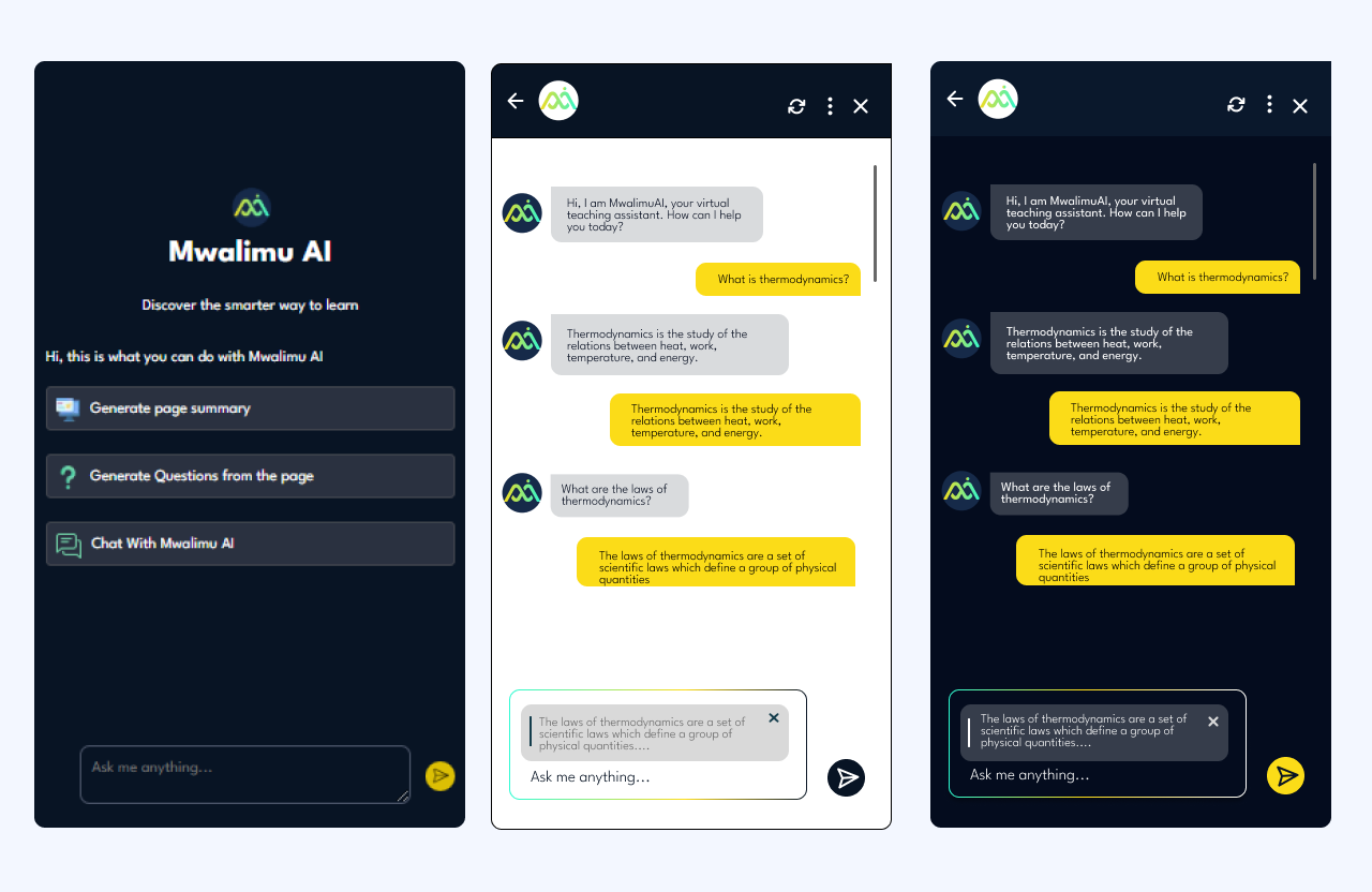
1. Chat over search
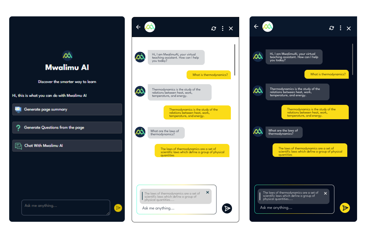
We initially considered a smart search bar. But students described their confusion as questions ("Why does this work this way?"), not keywords. A conversational interface matched how confusion actually feels; it lowered the activation energy to ask for help at all.
2. Context-based querying via text highlight
Students didn't always want to type out what they were confused about. By letting users highlight a passage and trigger a query from it, we reduced friction dramatically; the context was already there, the student just needed to surface the confusion.
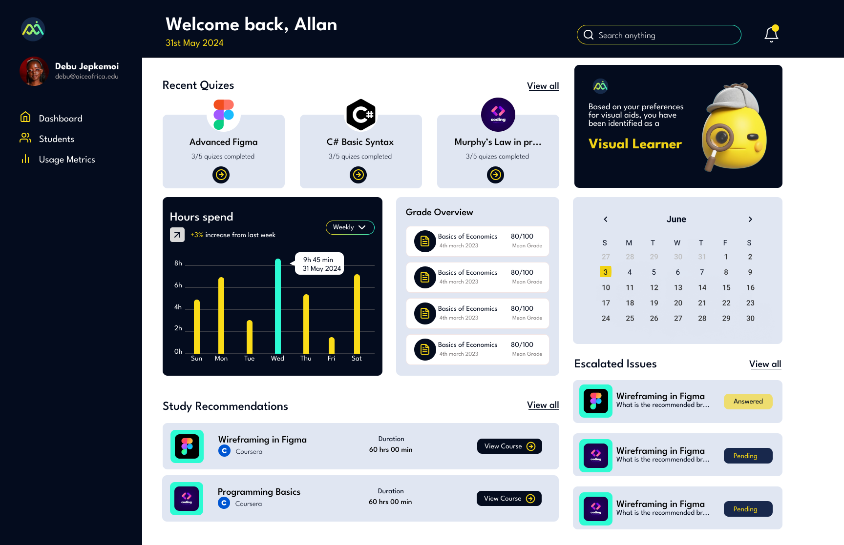
3. Separate dashboards for students and instructors
Students needed a personal view of their own gaps. Instructors needed an aggregate view of where the whole class was struggling. Merging these would have compromised both. Keeping them separate let each dashboard tell one clear story.
HOW I USED AI TO DESIGN AN AI PRODUCT.
Designing Mwalimu AI gave me a chance to put AI design tools into practice on a project that was itself about AI; which sharpened my understanding of both the possibilities and the limits.
My AI-assisted design workflow
ChatGPT- Used to rapidly generate and stress-test user scenarios. I'd describe a persona and ask it to surface edge cases I hadn't considered — which then fed directly into the functional requirements.
Stitch AI- Used to explore visual directions for the product's tone early in the process — before committing to a full Figma design system. Faster than mood-boarding from scratch.
Figma- layout generation from the concepts from ChatGPT and Stitch AI.
The biggest shift AI brought to my process: I spent less time generating options and more time making decisions. The design judgment — what to keep, what to cut, what actually serves the user — that stayed mine.
KEY SCREENS
LANDING PAGE AND TEXT INTERFACE FOR CONTEXT BASED QUERYING
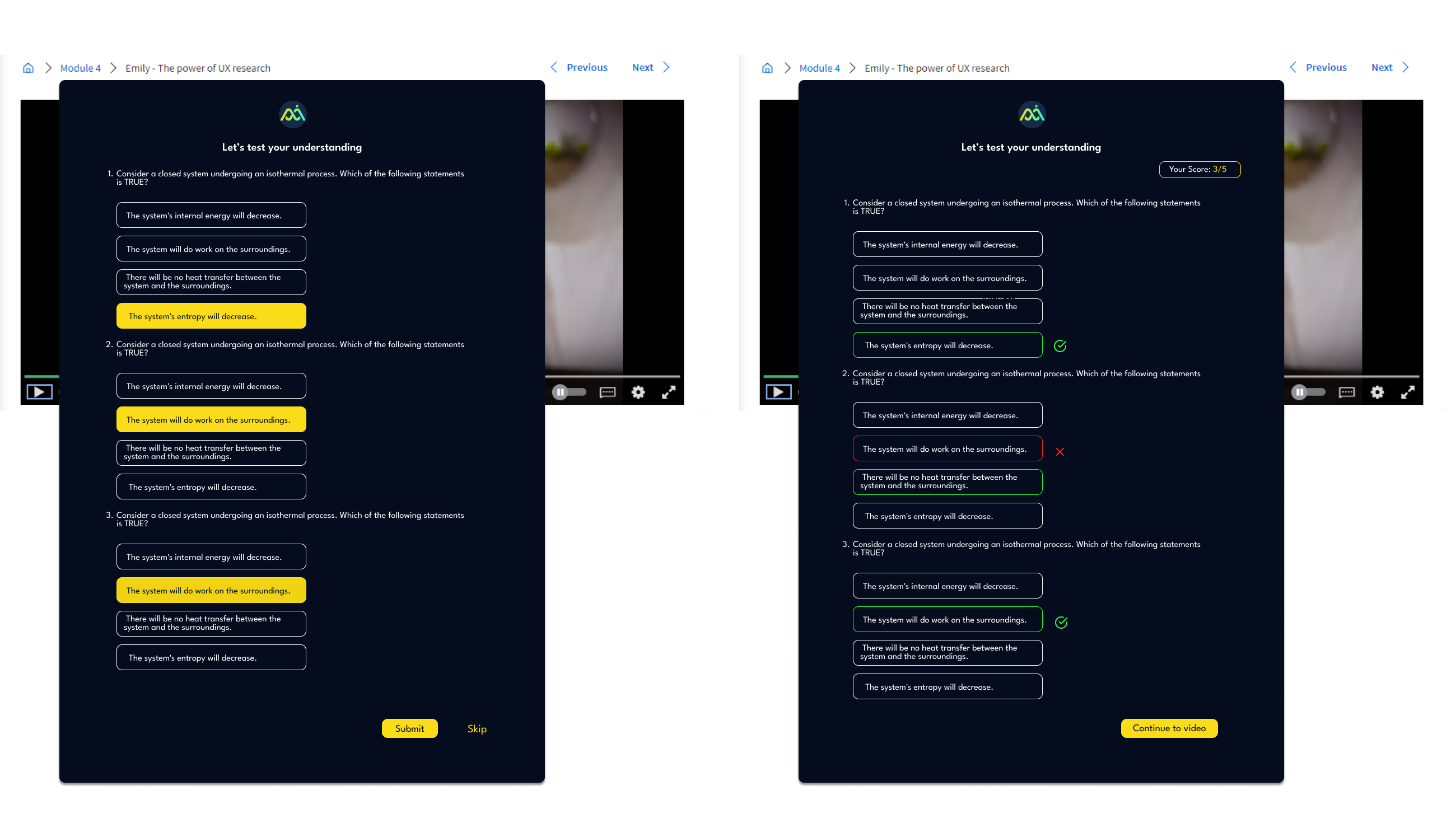
QUESTION GENERATION
STUDENT DASHBOARD
WEBSITE
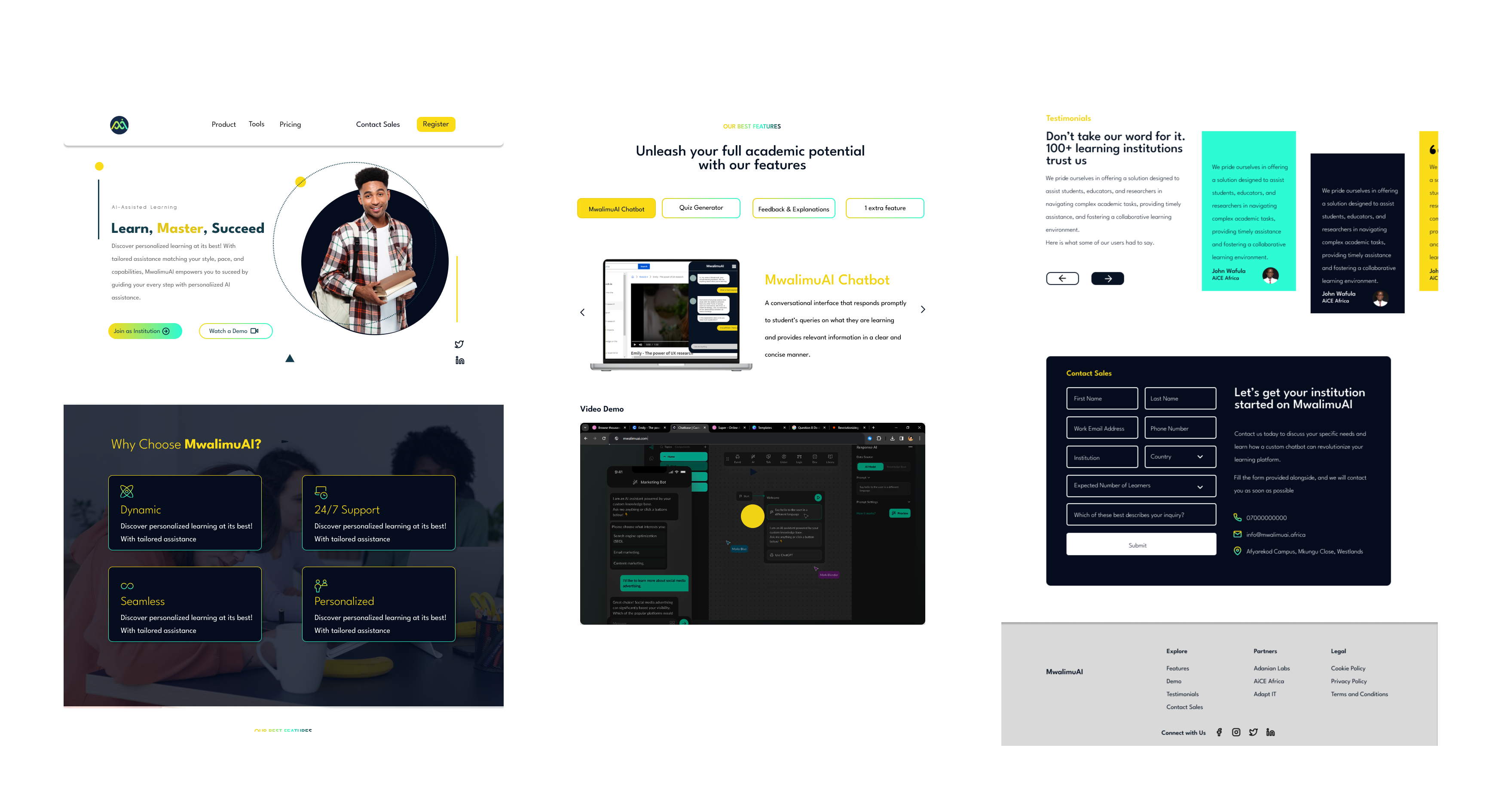
Stakeholder feedback after presenting the prototype was positive across both the institution and student-facing flows. The split-pane chat layout was called out specifically as solving a real navigation problem — students had previously been toggling between tabs to reference content while asking questions elsewhere.
The next iteration would focus on testing the question generation feature with real learners to measure whether self-generated quizzes improved retention compared to instructor-set assessments — the hypothesis that drove the feature's inclusion in the first place.
WHAT I'D DO DIFFERENTLY
Run usability tests on the highlight-to-query interaction earlier; it's a novel pattern and needed more validation than it got before going into high-fidelity.
Involve instructors in the research phase, not just the stakeholder workshops. Their mental model of "engagement" differed significantly from students'; surfacing that gap earlier would have sharpened the instructor dashboard design.
Design the mobile experience in parallel, not as an adaptation. Several interactions (especially the split-pane layout) required significant rethinking for smaller screens.